University City Public Library
“Bringing out the best” in a community icon.
-
Client: University City Public Library
Location: University City, MO
Completion Date: 2023
19,728 SF
$5.5M
-
Programming
Space Planning
Architectural Design
Interior Design
FF&E
Signage and Wayfinding
Construction Documents
Construction Administration
-
Retrofit of all building systems with energy efficient equipment.
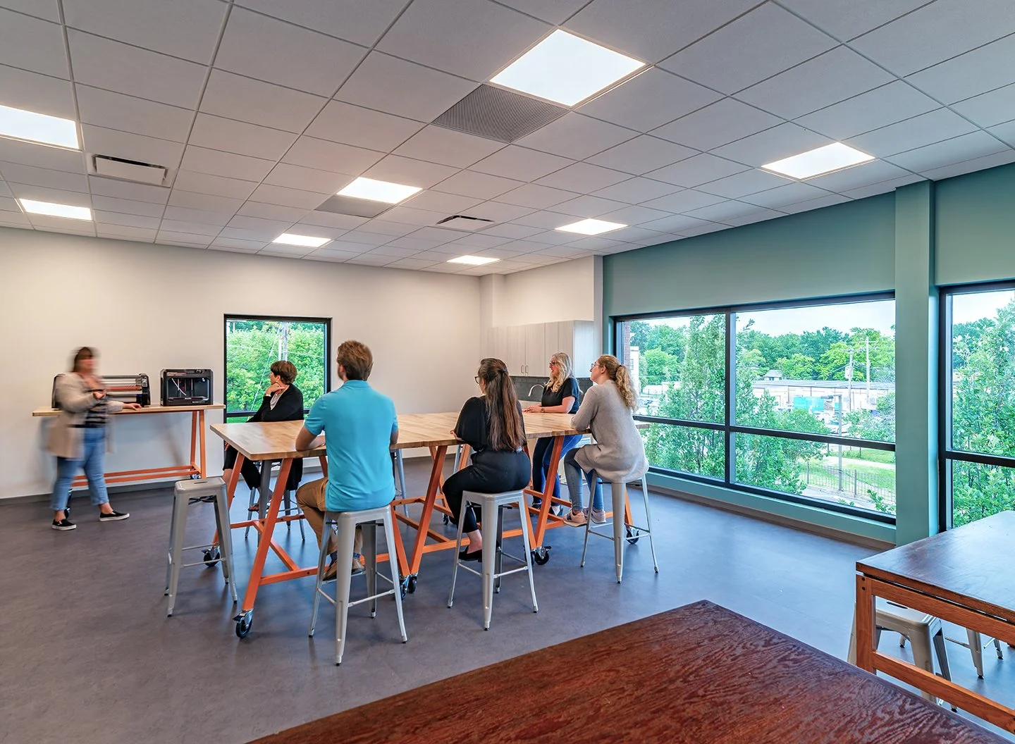
New 958 SF makerspace with natural daylight, sink, walk-in storage areas.
Improved safety and security, including clearer sightlines.
New work areas and study spaces, including a lounge (with laptop bar) and focus rooms with demountable walls.
Upgrades to Children’s and Teen Areas, including new furniture and a custom fabricated Lion’s Gate entry to Children’s Area.
Nestled in a bustling historic commercial district, University City Public Library was a community landmark since it first opened in 1969. The library is recognized as a striking regional example of Brutalist design. Derived from the French word “brut,” meaning uncut, rough, or raw, Brutalism emphasizes unpolished architectural materials and blocky, sculptural forms.
Because of its architectural significance, the library took their responsibility as the building’s caretakers seriously. Although the building was well-constructed and maintained, the aging interiors had not been updated since the 1960s. An expansive update was needed to better support the library’s current needs. Bond Architects’ challenge was modernizing the library’s interiors while maintaining the building’s distinctive character.
This project was featured in the September-October 2024 issue of Retrofit magazine — read the story here.
“Our patrons are delighted with the library’s new look. The renovated interiors feel fresh, modern, and inviting while harmonizing with the distinctive character of the library’s original mid-century architecture.
Bond Architects’ team listened carefully to our stakeholders and worked with us to develop interiors that captured our library and surrounding neighborhood’s unique sense of place. Because of their team’s collaborative approach, we now have a space that celebrates the ongoing story of our library and its surrounding neighborhood.”
Capturing Space Within Existing Footprint
The main impetus for a renovation was demand for space. Because the library was locked in by a dense urban setting, expanding outwards wasn’t feasible. Our team was able to capture 958 SF of useable space by moving HVAC equipment out of a mechanical room and onto the roof. The previous mechanical room was converted into a makerspace and multipurpose room. New rooftop mechanical systems were placed to ensure the equipment would not disrupt the appearance of the building. Louvers were converted into windows, allowing in natural light. After careful consideration, the library chose to use this new space as makerspace / multipurpose room.
Safety and Security
Safety upgrades, including a new code-compliant railing around the atrium, were designed to subtly blend in with the existing aesthetic. Carefully targeted changes were made to interior walls to improve visibility without disrupting the building’s original design intention. The library’s public restrooms were converted into a family restroom with airport-style entries, which improved safety in several ways: making the restrooms harder to barricade, providing clearer sightlines, reducing points of hands-on contact that could spread contagions, and improving accessibility.
Celebrating Sense of Place
Interior design referenced the library’s history to define a strong sense of place. A vibrant tapestry installed in the library’s atrium inspired the new interiors color palette. New furniture was chosen for affinities with the mid-century styles prevalent when the library was first built. Playful new lighting fixtures also paid homage to mid-century modernism. Integral Brutalist design features, such as bare brick walls, were kept in place.
The new Children’s Area contains a tribute to the surrounding neighborhood’s history. In 1909, the founder of University City, E.G. Lewis, commissioned a pair of giant gates topped by lions to be placed at the entrance of the city. These lions were intended to be symbolic guardians of the city. Lions have been the city’s beloved mascots ever since. A pair of fiberglass lion “bookends”, flanked by giant books, were added at the entrance of the Library’s Children’s Area to honor these city guardians


